When Bling Rules
Designing labels for a sparkling wine is a whole different ball game.
It’s all about occasion and celebration. Tearing off the gilded hood, untwisting the muselet, the anticipation of popping the cork – it’s an instant way of saying ‘let’s have fun’. Getting out the waiter’s friend and flicking off the crown seal doesn’t quite cut it.
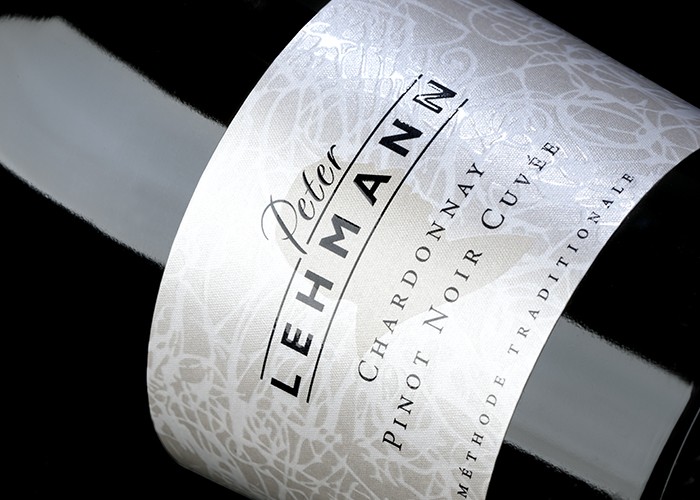
Bring out the foil, the embossing blocks, the sparkle and the bling.
We all know this is a female dominated market, so the design of a label needs to reflect this. Not to alienate the men though, as they still remain a large group of the purchasers.
What’s notably different these days is that the occasion to pop the cork is not just a birthday, festive season gathering or grandma and grandpas’ 60th wedding anniversary. Sometimes it’s as simple as ”I’ve made it through a hard day, give me some bubbles”! It’s the everyday drink of choice for many and why shouldn’t it be.
Price point and design define the worthiness of the occasion – and the volume of the ooh’s and aah’s when the cork pops.
We love designing sparkling wines. All inhibitions are gone and you can spend hours scrolling through the most decorative typefaces and embellishments that you just can’t use for still wines. It has no boundaries and we are fortune to have some fabulous local printers that can reproduce anything we want on paper.
And don’t underestimate the value of the hood design. It’s the first point of contact when opening the bottle. The texture, thickness of stock and embellishments all add to the experience. Muselets can also become collectors items with an amazing array of top and wire colours available and numerous print options.
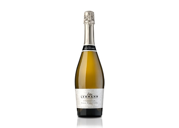
Credaro sparkling (shown here) was designed with our client’s wife in mind and why not: she was the perfect demographic and had a band of willing research participants. It came out with flying colours.
Published:
WBM: Wine Business Magazine
December 2012