Loyal, not precious
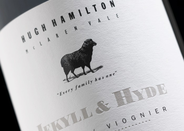
10 years ago (almost to the day) we presented to Hugh Hamilton and his team our re-designed branding and packaging concepts, introducing the black sheep. Since then, this lovable rogue has transgressed the world with his irreverent spin on wine.
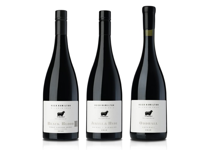
It’s always been one of our favourites and we’ve had fun and a mutually rewarding relationship with the HHW team over the years. When Mary Hamilton came to see us wanting to raise the benchmark on four of their wines and introduce new offerings exclusively for their Black Sheep Club members, we had to say good bye to our existing design and embrace a new way of delivering our friend to consumers.
They say we creatives are a precious bunch. I’ll deny that and say we are loyal, not precious. Not wanting to betray our wooly friend, we set about designing a range of labels the befitted his raised status.
Spoilt again by having great local printers, we were able to use three times the normal thickness of paper stock and sculpted the type and graphics into the label with a heavy mixture of deboss and gloss high build techniques. A simple two colour label came to life and oozed quality.
Hugh’s wonderful words of wisdom on the back labels add to the unique character and complete the total package.
See our new website for more images on this project and a selection of our new work ksdesign.com.au
Published:
WBM: Wine Business Magazine
June 2013