Honouring heritage. Positioning a family winery for its next chapter.
Some brands don't need reinventing.
They need careful evolution.
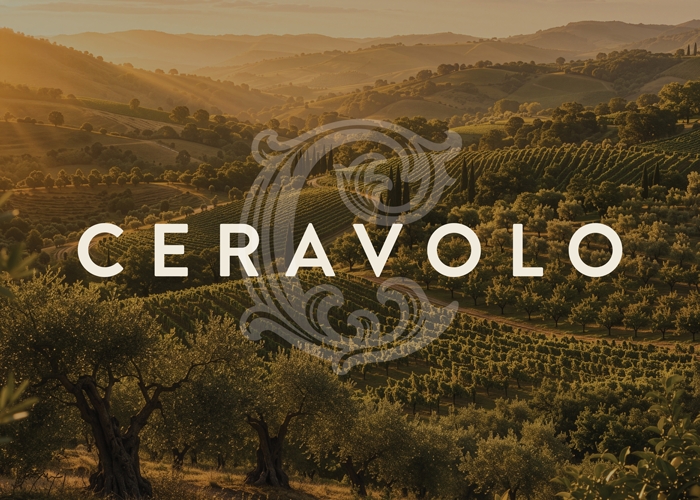
CERAVOLO has spent generations crafting wines that reflect the character of the Adelaide Hills and the values of a proud Italian family. As the business entered a new chapter, the opportunity wasn't to change who they were, it was to express their story with greater clarity, confidence and relevance for today's premium wine consumer.
Our role began by understanding what already made CERAVOLO distinctive. Family. Heritage. Craftsmanship. A genuine connection to place. These became the foundation for every creative decision that followed.
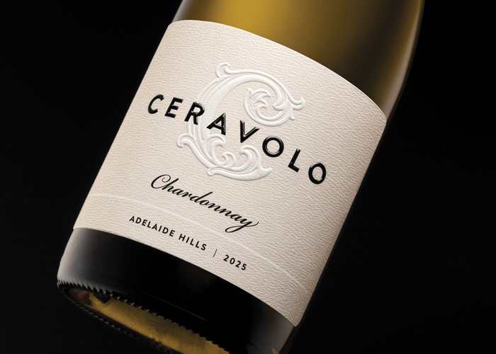
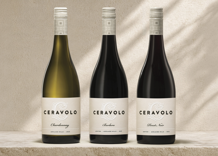
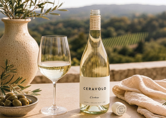
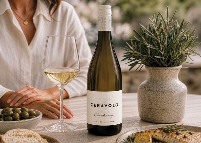
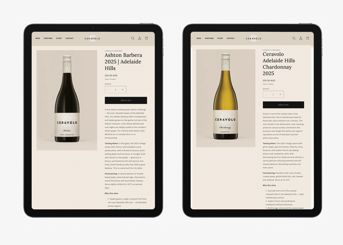
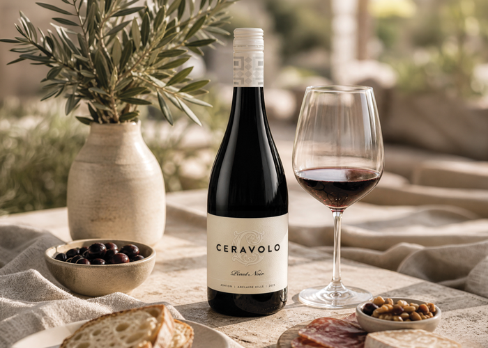
We developed a refined brand identity and premium packaging system that balances restraint with character. The new identity respects the winery's history while creating a more contemporary expression capable of engaging new audiences and strengthening the brand's premium positioning.
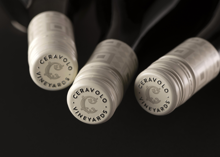
Every detail was intentionally considered, from typography and embossing through to the premium textured stock, custom screw cap and carefully specified print finishes. Rather than relying on decoration, the design communicates quality through simplicity, craftsmanship and materiality.
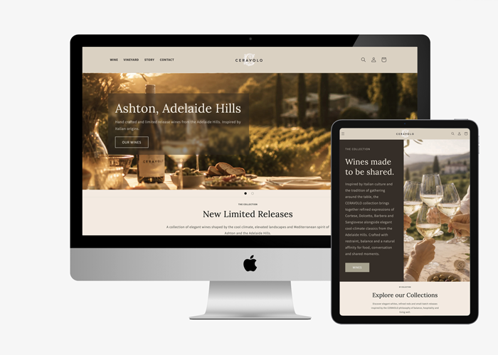
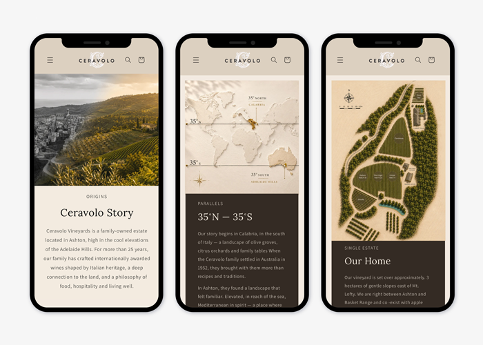
Beyond the packaging itself, the project established a cohesive brand language that extends consistently across every brand communication.
For CERAVOLO, the outcome is more than a new label. It is a stronger brand platform that celebrates provenance, honours family legacy and provides a foundation for sustainable long-term growth.
Project Scope:
Brand Strategy
Brand Identity Evolution
Packaging Design
Premium Print Specification
Brand Implementation
Published:
WBM: Wine Business Magazine
August 2026