When the balance is right
This was our extensive brief… I like uncluttered, landscape, white high quality textured stock, modern font, simple back label with minimal information. Ceteris paribus – meaning all things being equal – the wine is the result of the seasons.
Succinct and to the point! Fortunately we have known Kent for many years in his previous role as marketing guru at Hollick Wines so had a good insight into the personality to project on his labels.
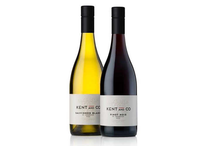
This is his first venture to put his own name to fruit grown on his Mt Gambier vineyard. Several years in the making, the last vintage saw everything aligned and balanced to take the step. Future plans are to collaborate with other district growers to present a small portfolio of premium regional wines (hence the ‘and Co’ in the brand name).
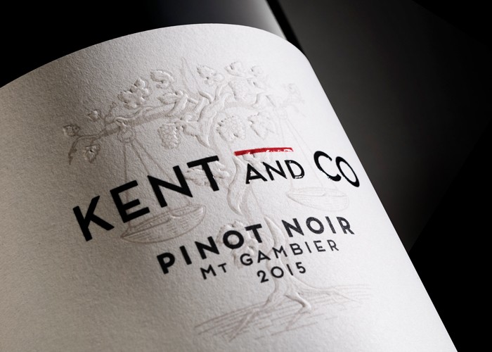
Starting with 200 cases, it’s difficult to be economic so we went for broke using beautiful thick textured stock, emboss and high build. These embellishment elements though are common on all labels so the major costs are up front and one-off. The hand drawn image of the vine and scales were derived from the very comprehensive brief!
Simplicity requires crafting and detail. Label Partners did an outstanding job on the printing resulting in a package of elegant quality befitting the wine.
Published:
WBM: Wine Business Magazine
March 2017