The Design is in the Detail
Selling wine is not easy these days. Selling a $130 bottle is even harder.
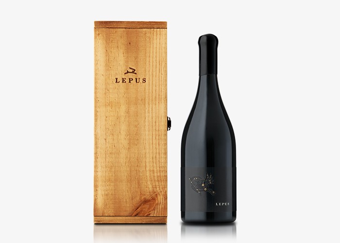
10 years ago we designed the Hare’s Chase brand and the packaging for 2 wine ranges. Our client came in earlier this year and said they had a small parcel of wine; something very special, and wanted a super premium package to add to their range. Very limited and only to be released in exceptional years, it required a name and label to befit the stunning quality wine.
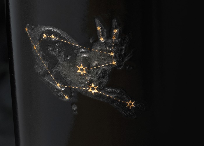
We all agreed on the name Lepus, which is the Latin word for hare and is also a dazzling southern constellation. Next we unearthed a wonderful old illustrated book of the stars, and the label design concept was born.
Simple in its layout, it required some special print embellishments to bring it to life. Collotype exceeded all expectations by using double thickness paper, hand tooled debossing, matt and gloss varnish and extraordinary fine detail in the gold foiling.
Each bottle is individually numbered and hand sealed with a wax dipped closure and housed in a simple, rustic, yet crafted wooden box.
We collaborated closely with each supplier, right down to the bottlers having to reduce the speed on their line to ensure the thick, long label adhered properly. This attention to detail has resulted in a total package worthy of the superb wine.
A leap of faith for all!
Published:
WBM: Wine Business Magazine
December 2013