Food Nation — Brand Refresh and Evolution
After more than a decade of success, Food Nation’s founder Rachel was ready to evolve her brand. Having created the original identity many years earlier, KSD was again invited to collaborate on its next chapter. A complete brand refresh that would capture the same independent spirit while evolving for the future.
The original brand had been cheeky and irreverent, a playful nod to “nationhood” expressed through bold, satirical visuals. Over time, however, shifting cultural and global contexts made it the right moment to explore a new direction — one that better reflected Food Nation’s creativity, authenticity and fun-loving personality.
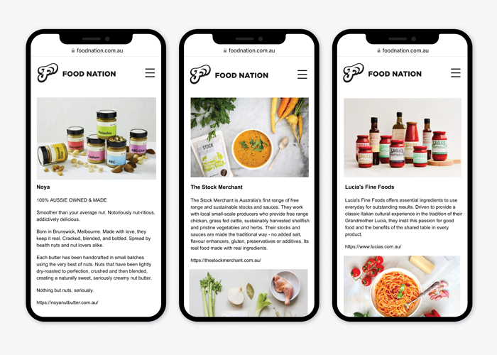
Working closely with Rachel through a series of collaborative ideation sessions, we refined the brand’s positioning and visual language. The result: a bright, organic and expressive new “F” brandmark — symbolising freshness, flavour and freedom. It’s bold, distinctive and completely unlike anything else in its category, just like Rachel herself.
Our work extended across:
The rebrand successfully reinvigorated Food Nation’s presence, adding long-term value and positioning the business for continued growth and future opportunity. It’s a great example of how KSD partners creatively with clients, bringing personality, strategy and design thinking together to deliver meaningful, enduring outcomes.
Published
October 2025


